Brand identity for Kraftverk

The two ladies behind this local startup totally rock too, and they needed a brand identity to boot! Kraftverk is Norwegian for power house; and it really is such a fitting brand name for this pair. Their business concept is all about developing and increasing the attractiveness of rural communities – and I think it’s pretty darn cool!
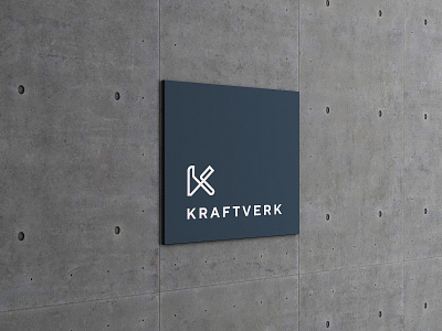
The logo icon is based around the letter K, but can also be seen as a funnel, a maze, a floor plan, a race track… the idea is that it should spark imagination and creativity! The lines are clean and sharp; we wanted to create associations to power and strength. We also wanted to avoid the stereotypic “traditional Norwegian countryside” look (think rose paintings, bunad, and ornate wooden carvings). Nothing wrong with a bit of heritage, but it’s kinda cliché to be honest. (I don’t want to shatter anyone’s romantic dream, but we tend not to wear our national costumes every day. Sorry.)
With the colour palette, we brought in a pale, dusky pink. Combined with a deep olive green and charcoal grey, and accents of distressed brass, the overall feel is that of contrast, yet still balanced. The typography further emphasises the contrast/balance theme, combining a modern serif with a clean and minimal sans.


