Find designers
Designer search
Quickly find your next designer
Post a job
The #1 job board for design talent
Inspiration
Courses
UX Diploma
Learn UX design from scratch in 6 months
UI Certificate
12-week UI skill building for designers
Live interactive workshops
with design professionals
Jobs
Go Pro
Log in
Dribbble: the community for graphic design
Log in
Sign up
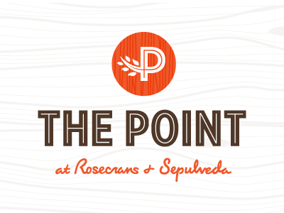
The Point Logo
Urban Influence
Available for work
Follow
Following
Like
Get in touch
#FDFDFC
#4F3728
#EF5426
#C8A79A
#EC3903
#766358
#E9896C
Download color palette
Here's a mark we're designing out for a shopping center in LA.
circle
handwritten
leaves
logo
monogram
script
wood
View all tags
Posted on Aug 21, 2012
2,196
7
72
9
View feedback
Urban Influence
Get in touch
More by Urban Influence
View profile
Previous
Next
Loading…
Loading…
Loading…