Monogram Pure Luxe

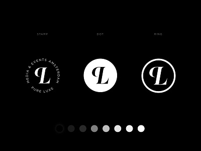
The monogram I created for Pure Luxe has a supporting role to the logotype. Designed to work in smaller sizes where the wordmark would become illegible. The letter ‘P’ is flipped horizontally to balance out the mark. This allows the monogram to fit inside of a circular shape, allowing it to be applied in a broad spectrum, such as these three examples of its use.
Check out the full project on Behance
Follow me for my most recent work Behance | Instagram | Twitter All Works Copyright © 2019 Lucas Berghoef


