Toggle

Quiltlist-updates_03

1 Attachment

17 Responses

  1. Pro Oykun Oykun

    Hi friends,

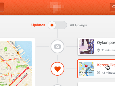
    Here is the toggle lets you switch between Updates view in timeline style and Group list view in grid style. Big group block at the left, list of updates for the group at the right.

    I'm guessing you will comment about giving depth to toggle, but why not using it flat and clean like this? I'm liking this (today).

    Comments are very welcome as always. Cheers,
    Ps, why not following me on Twitter today.

    - - - - -
    Update #1:
    I just attached inner dark shadow version, any better?

    9 months ago

  2. Pro Jesse Mainee Jesse Mainee

    The timeline is super clean dude. I'd add a subtile inner-shadow/gradient to the toggle background to help with depth though. This project has really come a super long way man. Really dope ;)

    likes

    9 months ago

  3. Pete R. Pete R.

    Very clean! Looking forward to see another part of this. :)

    likes

    9 months ago

  4. Pro M+O M+O

    everything except toggle looks beautiful. Love that simple style:)

    likes

    9 months ago

  5. Angel Jiménez Lopez Angel Jiménez Lopez

    Great timeline :-)

    likes

    9 months ago

  6. Pro Sebastian Sandqvist Sebastian Sandqvist

    Even though you're going for flat & simple on the toggle, at least give its background an inset shadow. You've used shadows in a ton of other places already, so why not -- for consistency's sake -- continue using them on the toggle where they're expected?

    likes

    9 months ago

  7. Pro Deanna Mitchell Deanna Mitchell

    Looks great! If I had to be nit-picky, I would agree that the toggle could use some depth. Just in the grey bit.

    likes

    9 months ago

  8. Pro Michael Castro Michael Castro

    Beautiful timeline. I really like the color pallete. I agree with the toggle shadow question, I think it would improve the design and give it a little more depth.

    likes

    9 months ago

  9. Vaibhav Bhat Vaibhav Bhat

    I can say this is so far the most beautiful designed web app I've seen ^.^

    likes

    9 months ago

  10. Pro Oykun Oykun

    @Jesse Mainee Thanks mate. I attached edited toggle with subtle inner shadow. Any better? /cc @M+O @Sebastian Sandqvist @Deanna Mitchell @Michael Castro

    @Peach Thanks! more to come soon :)

    @A. J. Lopez Thanks!

    @Vaibhav Bhat Thanks! You are too kind!!

    9 months ago

  11. Pro Jesse Mainee Jesse Mainee

    @Oykun Perfect dude!

    9 months ago

  12. Pro Sebastian Sandqvist Sebastian Sandqvist

    @Okyun Much better! Personally, I'd darken the border so the shadow is more distinct, rather than bleeding into the top, but it's definitely fine the way it is. If that's not viable, maybe slightly lighten the toggle's background.

    9 months ago

  13. Pro Deanna Mitchell Deanna Mitchell

    @Oykun perfecto. You're a good sport. :)

    9 months ago

  14. Pro Mason Yarnell Mason Yarnell

    Reeeeeefreshing! Perfect summer palette.

    9 months ago

  15. Pro Oykun Oykun

    @Jesse Mainee @Sebastian Sandqvist @Deanna Mitchell Thanks folks!

    @Mason Yarnell haha Thanks mate! designing summer palette from rainy/gray England :|

    9 months ago

  16. Pro Geldy Geldy

    I really like your style! So clean... All of your shots are so beautiful!

    likes

    4 months ago

  17. Pro Oykun Oykun

    Thanks @Geldy , you are too kind!

    4 months ago

keyboard shortcuts: previous shot next shot L or F like