Find designers
Designer search
Quickly find your next designer
Post a job
The #1 job board for design talent
Inspiration
Courses
UX Diploma
Learn UX design from scratch in 6 months
UI Certificate
12-week UI skill building for designers
Live interactive workshops
with design professionals
Jobs
Go Pro
Log in
Dribbble: the community for graphic design
Advance your career with a Professional Diploma in UX Design
Learn more
Log in
Sign up
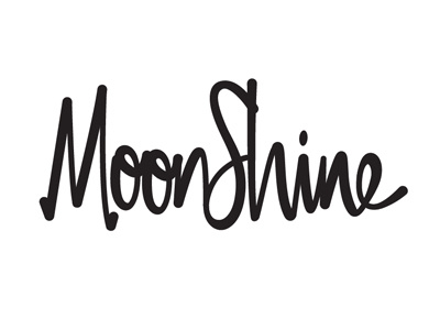
Moon Shine
Jeremy Reiss
Available for work
Follow
Following
Like
Get in touch
#FFFFFF
#221E1F
#C1BFC0
#5F5D5E
#413D3E
#A19FA0
Download color palette
Custom lettering experiment for a Kentucky yoga studio.
custom
moon
script
shine
typography
unused
yoga
View all tags
Posted on Aug 16, 2012
1,116
2
26
7
View feedback
Jeremy Reiss
Get in touch
More by Jeremy Reiss
View profile
Previous
Next
Loading…
Loading…
Loading…