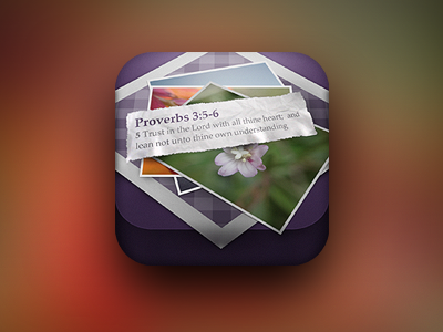
Client Icon - Version 2

9 Responses

  1. Mike Beecham Mike Beecham

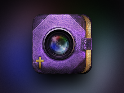
    Ok, so this is the second and final iteration of my client's icon project. As you can see we ended up going in a totally different direction, but I'm really happy with it as a finished icon.

    Everything has been created in Photoshop. Thoughts are always welcome guys. Thanks

    10 months ago

  2. Jonathan Ogden Jonathan Ogden

    I love those pages on the right! The cross seems to be a bit too 'punched in' if you know what I mean. I think it's just that the shadows and highlights underneath are a bit too heavy. And is there a bit of snake belly going on with those page corners? Looking really good though buddy! Looking forward to seeing more.

    likes

    10 months ago

  3. Max Litvin Max Litvin

    Van helsing camera?

    likes

    10 months ago

  4. Philip Clark Philip Clark

    Mike, this looks super sharp! I think it's a big improvement from v1. Great job w/ the texturing and the gold leaf.

    10 months ago

  5. leef leef

    like~。~

    10 months ago

  6. Waseem Arshad Waseem Arshad

    nice

    10 months ago

  7. Tobia Crivellari  Tobia Crivellari 

    Fantastic! Love the texture!! :-) @Mike Beecham

    10 months ago

  8. Aden (Tackham) Ra Aden (Tackham) Ra

    Wow! Paper detail is Great!!

    10 months ago

  9. Jack Bingham Jack Bingham

    Agree with @Jonathan Ogden + I feel like there's too many elements fighting for attention — those elements are REALLY nice, though!

    10 months ago

keyboard shortcuts: previous shot next shot L or F like