Youtube app (wip)

Hi my friends!
I`m here with the idea for the youtube app and here is reason why when iOS 6.4 (hope it was it) was released apple removed the original youtube app - so i decided to make one on my own! I know google is going to make one, but i like to do things my way!
So goals of the app:
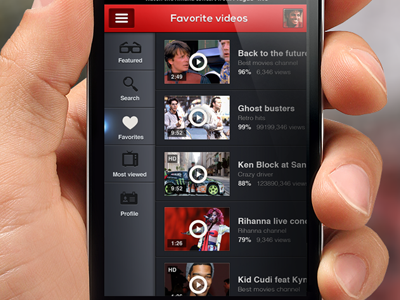
Make it simple as hell, Display more content instead of 4 videos per screen 5 videos, main bar adds, display only inportant things (video screen, lenght, name, views and play - boom). Use the side menu instead of clasic menu at the bottom (basic inspiration by Jackie Tran thank you dude :))
I have lot of more screens to show and lot of more stuff, so if you are developer or just interested send me message on twitter or email! :)
Hope you like it and if you might would like to see real pixels:
http://cl.ly/image/0b1N000F3v3g
Texts are only for ilustration ;)
Sorry for that mistake dou is not do! :)


