Adam_west

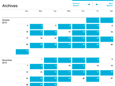
More Calendarical Schtuff

Shot_1287628712

19 Responses

  1. Pro Adam_west Khoi Vinh

    Not destined for the kind of project it might look like it's destined for.

    over 1 year ago

  2. Twitterprocutcolor Ryan Barr

    Looks slick, however I'm not sure how I feel about the whitespace around the days.

    I also assume a December would be below the November seeing as it is going quarterly, correct?

    likes

    over 1 year ago

  3. Pro G5sm Gareth Botha

    Nice and clean - dig it!

    over 1 year ago

  4. Pro Adam_west Khoi Vinh

    Ryan: What don't you like about the white space around the days? And yes, Dec comes right after Nov. ;-)

    likes

    over 1 year ago

  5. Pro Jonathan_hoefler Jonathan Hoefler

    You have such a light touch with a grid, Khoi. This is really beautiful.

    over 1 year ago

  6. Img_3527b Gilbert Lee

    It feels great!

    over 1 year ago

  7. Spaceman Ryan Lottering

    Beautiful. You show mastery of the grid, good sir.

    over 1 year ago

  8. Pro Photo_oct_27__9_07_38_pm_copy Henry Moran

    This is why I follow you.

    over 1 year ago

  9. Pro Avatar Ian Storm Taylor

    I agree on the white space around the days, but only depending on the final size of the grid. At this size it creates an annoying optical illusion. But I think at a larger size, which I assume it is, the effect will be reduced.

    over 1 year ago

  10. Pro Adam_west Khoi Vinh

    Ian: can you describe the optimal illusion? I'm too close to this to really be able to see for myself. I could use a cold eye!

    over 1 year ago

  11. Pro Noahlevin_5 Noah Levin

    I don't actually mind the white space, but I do think it calls attention to itself. Also I think the optical illusion is a much less severe version of this one.

    Love the big click targets on the previous quarter and next quarter though. In general this feels very inviting— great work.

    over 1 year ago

  12. Pro Clint-eastwood Geof Crowl

    What's the final size? I think the optical illusion wouldn't show up if it's much larger.

    over 1 year ago

  13. Pro Adam_west Khoi Vinh

    The final size is basically yer standard 1024w Web page. I see the optical effect you guys are mentioning now. Let me see if I can do something about that.

    Thanks everyone!

    over 1 year ago

  14. Pro Dribbble Jesse Gardner

    Hey Khoi: Love the concept here. I've always struggled with useful ways to present archives.

    The bright blue makes it feel too noisy, though; could you cut the opacity of the color in half? That might make it compete less with the content as well as addressing the strange optical illusion @Ian mentioned.

    over 1 year ago

  15. Pro Si-tn Shaun Inman

    Don't listen to ’em Khoi, everything is perfect as is. Except for the arrows, those have to go :P

    likes

    over 1 year ago

  16. Pro Dribbble Jesse Gardner

    What do you get when you post your inspiration to Dribbble? Too many cooks! ;)

    over 1 year ago

  17. Pro Adam_west Khoi Vinh

    Hehe, but I dig it.

    over 1 year ago

  18. Pro Adam_west Khoi Vinh

    By the way, I can finally reveal that this is a sample from my forthcoming book about grids.

    over 1 year ago

  19. Ryanf_bw Ryan Fernandez

    So clean. Beautiful work, Khoi.

    9 months ago

keyboard shortcuts: previous shot next shot L or F like