Icons for website

Icons

13 Responses

  1. Kerem Suer Kerem Suer

    Tiny parts of a not so tiny project. I never specialized in icon design, so go easy on me.

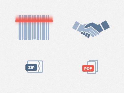
    Scanner, networking, ZIP File, PDF File

    10 months ago

  2. Pixelogic Pixelogic

    They look awesome. Great job Kerem!

    10 months ago

  3. Arjun Mahanti Arjun Mahanti

    these look great! the pattern for zip is clean and clever. if anything, id say the scanner blur could use some more love

    likes

    10 months ago

  4. Zach Herring Zach Herring

    The fingers on the handshake seem too long (unless that's a stylistic choice). I'd also like to see similar shapes on pdf repeated for the zip. Otherwise, super nice style, like the palette too. Nice stuff, dude.

    10 months ago

  5. Rich McNabb Rich McNabb

    For me the bar code icon seems to break away from the clean style of the others and (without seeing the whole project) may look out of place in the finished product.

    10 months ago

  6. 10 months ago

  7. Marian Pop Marian Pop

    Love the style.

    10 months ago

  8. Juan Gomez Juan Gomez

    My advice would be.

    Add red to the others or leave them blue all; including a different color specially in shape icons make them "pop" more than the other ones, I'd be great if the red ones were the "call to action" ones.

    Again with the bar cade scanner you add a different element from the rest, besides red you're using a gradient and blur, causing conflict with the rest of the theme, in here there's not much to do as you can't really get away the scanner concept without the gradient, but keep of the blur leave the gradient sharp and make it get to a third the code.

    And I'm with @Jens Windolf about the pdf and zip, both represent files so you should consider keeping them the same shape.

    10 months ago

  9. Jason Rai Jason Rai

    Absolutely loving that bar code scanner.

    10 months ago

  10. Philip Clark Philip Clark

    Great work on the .zip

    10 months ago

  11. Ricardo Salazar Ricardo Salazar

    Not convinced with the scanned blur (different style). And would make the file type icons (zip and pdf) the same orientation.
    Other than that they look great.

    likes

    10 months ago

  12. Scott Dunlap Scott Dunlap

    Dig the colors Kerem. One thing I noticed was the barcode is pretty tight. Usually the amount of whitespace is similar to the bars themselves.

    10 months ago

  13. Andrei Atrokhau Andrei Atrokhau

    Brilliant!

    9 months ago

keyboard shortcuts: previous shot next shot L or F like