Fixel Progress


Some revisions to the previous version. Teams in agreement that this is the direction we are going to go.
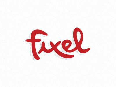
What I did in this version, was make the bottom of the F less curvy and make the F bigger overall to match the height of the L.
I edited the tops of the X's and then added the stem on the left side of the E - This helped the legibility to read more as Fixel now instead of Fixd or Fixed.
*UPDATE:
Here is a look of the version above with a slightly modified letter F to help accomodate a dot over the letter I: BOOM.
As Vin has clearly pointed out, we won't be going with the dotted "i" -- it was merely for your enjoyment. :)