PeopleOps - Human Resources Management

⚡ Tips on Designing Dashboards with charts that work.
———
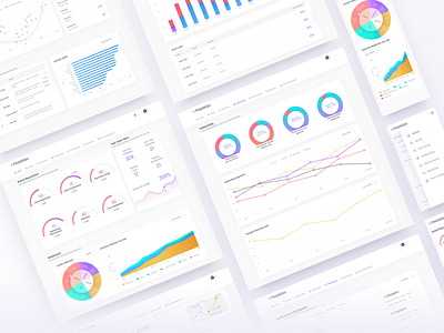
💭There's probably no dashboard without data visualizations, PeopleOps reached out to me, they were like: look we have this website full of charts and stuff, charts are boring, can you design something that can make this interface enjoyable and a bit fun.
———
🤔Here what I learned.
There are a million types of charts so here's where to look:
- Google Charts Gallery - examples of the most used charts.
- The Data Visualisation Catalogue - Charts you can't find on Google Charts :) 🎨 Be careful with colors.
1. Use colors that won’t distract from the data.
2. Try not to use the same colors on the same chart.
3. Use colors that reflect the type of information.
4. Avoid two-colored gradients. 📊 Data vs Visuals
Be careful while designing the elements, design with data in mind, charts don't always have to be the sexiest thing about the dashboard. -Use familiar chart types, don't experiment with visual ideas.
-Avoid 3D charts.
-Only include the legend and grid lines when needed. 🔑 Also the last but not least, design with real data.
Designers have a tendency of using data that looks beautiful on a showcase, if charts look good only on the showcase its time to rethink the design.


