


Landing page for iOS iPhone app

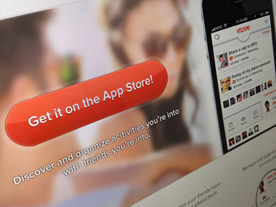
Did a landing page for a client. We are doing a couple more versions, but this was one.
Had some inspiration from Bill S. Kenny here. I like his rounded button styles and blurred photos. He does it better though :)
Sorry, cant show full shot until client signs off :)


