Client Project Icon

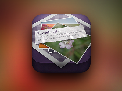
Working on an icon for a client project, this being the first iteration. It's a combination of photos and relevant passages from the bible to work in tandem with the photo...pretty cool actually!
I thin the icon might be a little busy at the moment, and I might need to strip some stuff back, but it's all created by hand...and the photos are my own :)
Anyway, let's have your thoughts/feedback and I'll see where I can make it better.
Pixels are included for a close-up
Thanks.


