Sweet work! The calendar/view map button alignment seems weird to me though. Does the color around "Event is in 8 Days" change depending on proximity of date?
Can't wait to see the final product in the app store :D
@Zethus Suen I'm still working on the alignment of the buttons. Color doesn't change currently, but I love the idea! I'll let you know when it hits the store!
I like it! Two small things:
1) I'd make the sidebar menu button an actual button for usability and discoverability.
2) The pink seems a little bright. Maybe tone it back a touch...?
6 Responses
Pro
Tyler Howarth
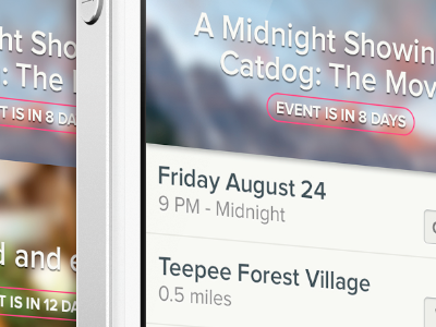
Stripped it all down. Thoughts?
(Be sure to look at the full version: http://dribbble.com/shots/682046-My-Events-v2/attachments/61227 )
10 months ago
Pro
Adam Debreczeni
Way nicer, good job. I'd keep the icons from the last screen though to help the user easily parse the content.
10 months ago
Pro
Zethus Suen
Sweet work! The calendar/view map button alignment seems weird to me though. Does the color around "Event is in 8 Days" change depending on proximity of date?
Can't wait to see the final product in the app store :D
10 months ago
Pro
Tyler Howarth
@Zethus Suen I'm still working on the alignment of the buttons. Color doesn't change currently, but I love the idea! I'll let you know when it hits the store!
10 months ago
Pro
Zethus Suen
@Tyler Howarth Unfortunately I'm one of the few in DPL with an android. I'll stare at the scaled version on my iPad though.
10 months ago
Pro
Luke Bornheimer
I like it! Two small things:
1) I'd make the sidebar menu button an actual button for usability and discoverability.
2) The pink seems a little bright. Maybe tone it back a touch...?
9 months ago