Find designers
Designer search
Quickly find your next designer
Post a job
The #1 job board for design talent
Inspiration
Courses
UX Diploma
Learn UX design from scratch in 6 months
UI Certificate
12-week UI skill building for designers
Live interactive workshops
with design professionals
Jobs
Go Pro
Log in
Dribbble: the community for graphic design
Log in
Sign up
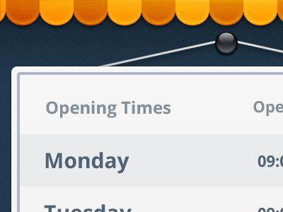
Opening Times
coconut
Follow
Following
Like
#ECEDEE
#1E3446
#F9A20A
#D86B00
#73828F
#515D68
Download color palette
Something simple :3
ios
iphone
store hours
ui
View all tags
Posted on Aug 9, 2012
7,833
2
98
10
View feedback
coconut
More by coconut
View profile
Previous
Next
Loading…