RISE Cold Brew Landing Page

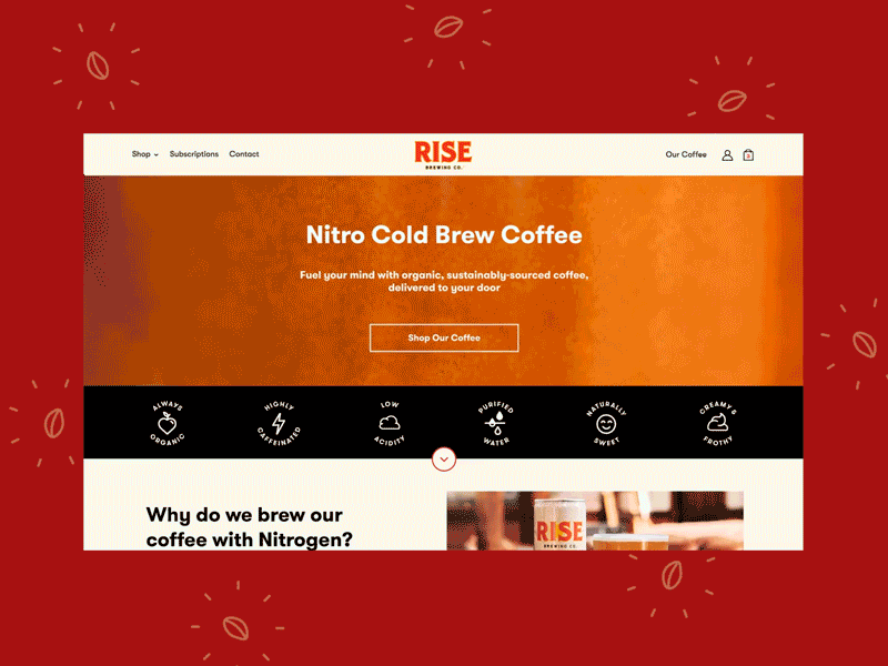


At that time, RISE’s current homepage was the landing page for all visitors. The page’s hierarchy, content and layout had room for improvement in order to communicate clearer about the products. Due to the many different benefits of why customers drink RISE, they experienced difficulty focusing their messaging in order to appeal to the majority.
It was clear that different landing pages were needed in order to better target their different kinds of customers which their ads were targeting. We decided to create a lander for “general” users to test against their current homepage, as well as a second lander for “health-conscious” users.
After analyzing user behavior and analytics, I designed the landing pages to have improved hierarchy of information, optimized messaging, and fresh photography and layout. Elements were added to increase engagement through strategically adding CTAs, cross-selling products, and utilizing social proof through product reviews and Instagram.
For the health-conscious lander, I highlighted different content, sections and photography styles to closely target the elements of RISE coffee that would interest that kind of user. All elements on the page were designed and built to be modular for easy A/B testing.
The new landers increased conversions by 34% when compared to the original website homepage, bringing their conversion rate to 4.35% which is more than double the industry average.


