Guide to Europe Website Design Animation


Hey there!
Experimenting with anti-UX here at Zajno, I came up with some bold designs for a web guide to Europe, and now that I have it animated I'd like to hear out your opinion.
Goals
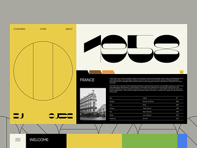
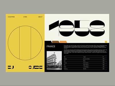
The idea was to experiment and push the limits of what we are used to calling “normal”, operating on the line between order and chaos.
Approach
As I was aiming at creating something ahead of the curve, standards needed to be rejected to make way for some innovative solutions. I went for the unconventional approach in everything: layout, fonts, colors. I also decided to stick to minimalism, or even ultra minimalism as you can see, for example, in the way I visualized flags. One of my favorite details here is the font: that was love at first sight, I’ve wanted to use it for a long time and I’m happy that this day has finally come!
Result
I ended up with an extravagant and minimalist website design that tells about different European countries in a laconic, but informative way. Eager to hear your thoughts on this one!
Press "L" to show some love!
ᗈ Join our Newsletter!
ᗈ Website
ᗈ TheGrid
ᗈ Spotify
ᗈ Twitter
ᗈ Medium
ᗈ Facebook
ᗈ Instagram