Mouapp icon 2.0

15 Responses

  1. Pro Chee Fang Chee Fang

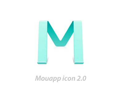
    hey guys, i am so glad to show u the Mouapp icon 2.0, which updated from http://dribbble.com/shots/288059-M
    Mou is a popular markdown editor for web developers, developed by @chenluois (twitter), see details here: http://mouapp.com/

    don't forget to check the large size in attach

    10 months ago

  2. Popo Popo

    还是很性感哦

    likes

    10 months ago

  3. Vincent Vincent

    The icon is not centered, as you can see here, it needs to be aligned more to the right, compare the right side to the left side, and there's a space of 11px, this might only be for the preview though.

    likes

    10 months ago

  4. Pro Sanadas young Sanadas young

    nice!~~

    likes

    10 months ago

  5. Johnny Johnny

    鸭仔牛逼

    likes

    10 months ago

  6. Pro Chee Fang Chee Fang

    @Vincent omg, that's soo embarassing :p

    likes

    10 months ago

  7. 铅笔 铅笔

    chao nu bi

    likes

    10 months ago

  8. Pro Shin Shin

    张开的大腿~~

    likes

    10 months ago

  9. Kurt Madsen Kurt Madsen

    Why the change?

    likes

    10 months ago

  10. Chris Xu Chris Xu

    美!

    likes

    10 months ago

  11. Paco Paco

    M...

    likes

    10 months ago

  12. Pro Chee Fang Chee Fang

    @Kurt Madsen cuz i hope the "M" is not only a shelf but also a font with beautiful shape. and the original one got too rich saturation, then it showed extremely unstable in different display, some of them look totally washed out. since i was required to ad 1024px icon for retina display, i try to let everything i can do happen.

    10 months ago

  13. Pro Mike Stezycki Mike Stezycki

    Really nice changes, subtle but welcome.

    10 months ago

  14. Pro iTu ☺ iTu ☺

    在用呢,亲! :P

    10 months ago

  15. plidezus plidezus

    换了图标立马感觉不一样了!

    2 months ago

keyboard shortcuts: previous shot next shot L or F like