I like, it's clear and simple. But I would advice you to add real data to it. What if the website is http://www.behance.net/iband/frame/All. Would it be convenient to edit such a long URL?
Sign Up is red. I like to color, but in my opinion it's not so great for button that have positive meaning. It's more suitable for cancel. I would use blue of green. Moreover you have green already and it's a good practice to try to minimize everything in your design, starting from the number of fonts used, ending number of colors.
@Vitaly Ishkulov Thank you so much for your great feedback, mate! :) As you said I already have used green and I wanted to use a colour which match with the overall design! :)
Nice detail put into the form elements. They look great. If the intent is to make this form easy to fill out, the layout could use to work. I'd suggest picking up Luke W's Web Form Design or reading theseposts on Smashing Mag. Cheers!
17 Responses
Pro
Daniel Fass
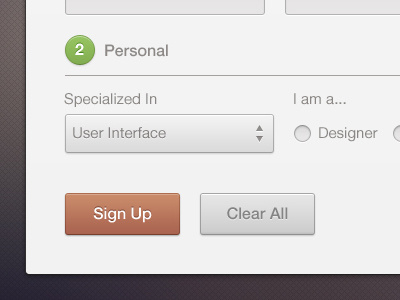
A modal window, which allow you to create an account. What do you think?
Please don’t forget to check out the attachment! :D
Don’t forget to press "L" on your keyboard! :)
--
Stalk me on twitter
10 months ago
Pro
Bobby Giangeruso
I'm a sucker for clean designs just like this. :)
Keep it up!
10 months ago
Pro
Daniel Fass
@Bobby Giangeruso Thanks man, I really appreciate it! :)
10 months ago
Pro
Nuruzzaman Sheikh
amazing work mate! love the cleanliness so much!
10 months ago
Pro
Daniel Fass
Thank you so much @Nuruzzaman Sheikh :)
10 months ago
Pro
Vitaly Ishkulov
I like, it's clear and simple. But I would advice you to add real data to it. What if the website is http://www.behance.net/iband/frame/All. Would it be convenient to edit such a long URL?
Sign Up is red. I like to color, but in my opinion it's not so great for button that have positive meaning. It's more suitable for cancel. I would use blue of green. Moreover you have green already and it's a good practice to try to minimize everything in your design, starting from the number of fonts used, ending number of colors.
But back again, I like it. It looks awesome dude.
10 months ago
Pro
Daniel Fass
@Vitaly Ishkulov Thank you so much for your great feedback, mate! :) As you said I already have used green and I wanted to use a colour which match with the overall design! :)
10 months ago
Going with @Vitaly Ishkulov's comment, I would actually use blue for the numbers, and green for the submission. Very clean though :) Love it!
10 months ago
Pro
Darina Matvienko
Clear! And nice colors :)
10 months ago
Pro
Daniel Fass
@Paul Leon Mederos @Darina Matvienko Thank you! :)
10 months ago
Pro
Ben Bate ⚒
Brilliant!
9 months ago
Pro
Daniel Fass
@Ben Bate Thank you! It's a pleasure for me to hear that from such a great designer! :D
9 months ago
Pro
Arturo Esparza
I like the style. Well done!
9 months ago
Pro
Daniel Fass
@Arturo Esparza Thank you very much!
9 months ago
Pro
Andrei Atrokhau
So clean! So clear!
9 months ago
Pro
Daniel Fass
@Andrei Atrokhau Thank you!
9 months ago
Pro
Ted Goas
Nice detail put into the form elements. They look great. If the intent is to make this form easy to fill out, the layout could use to work. I'd suggest picking up Luke W's Web Form Design or reading these posts on Smashing Mag. Cheers!
9 months ago