Interactive Pie Chart - Top Cuisines

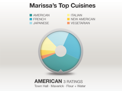

Made a fun and interactive pie chart that displays a Ness user's top cuisines. You can swipe a section of the pie chart to change which cuisine type you are viewing.
This will go on the Ness User Profile, which I'm giving a complete makeover :)
Feedback welcome. A version of this is coming soon to Ness Dining Guide!


