Find designers
Designer search
Quickly find your next designer
Post a job
The #1 job board for design talent
Inspiration
Courses
UX Diploma
Learn UX design from scratch in 6 months
UI Certificate
12-week UI skill building for designers
Live interactive workshops
with design professionals
Jobs
Go Pro
Log in
Dribbble: the community for graphic design
Advance your career with a Professional Diploma in UX Design
Learn more
Log in
Sign up
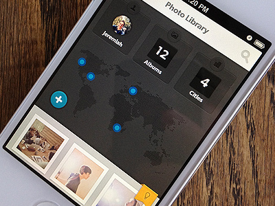
Dark Map data
Jeremiah Shaw
Available for work
Follow
Following
Like
Get in touch
#2B2725
#B5B0B5
#5D5250
#EBE7E0
#906A4C
#694A33
#8F8C71
Download color palette
More in-app data experiments for an app I was working on.
app
blue
buttons
data
gray
infographics
inforgraphic
ios
iphone
map numbers
photo
ui
visual data
View all tags
Posted on Aug 5, 2012
31,594
124
462
17
View feedback
Jeremiah Shaw
3D illustration, animation & design
Get in touch
More by Jeremiah Shaw
View profile
Previous
Next
Loading…
Loading…
Loading…