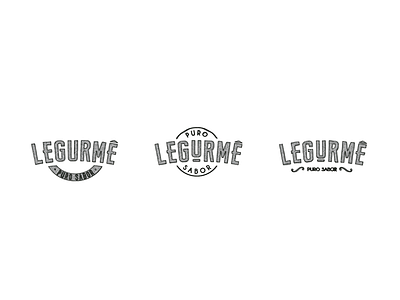
Branding Logo Process for Legurmê
Legurmê produces healthy products for busy people.
Named by the combination of two words, legume (vegetable in Portuguese) and "gourmet", a cultural ideal associated with the culinary arts of good food. Legurmê is perfect for the modern kitchen — mixing cursive and tall sans serif fonts, using bright color coding, and combining pure ingredients for pure flavors. With images of the 100% natural ingredients and more detailed write-ups on the side of the label, the brand is positioned as a gourmet, premium product. The kitchen-inspired logo also translates onto other Legurmê products, like t-shirts or paper bags, allowing for expansion.
We created the branding and packaging for Legurmê, resulting in a design that looks just as delicious as the varieties of antipasti the brand offers.
See the results: https://www.behance.net/gallery/23589363/LEGURME


