


Let's Travel Somewhere

Hey Dribbblers!
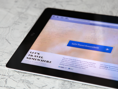
I'm really excited to launch a tiny sneak preview of 'Let's Travel Somewhere' today. Of course this is just the very first stage and there's still a lot of work ahead. However, I'd really appreciate every feedback and input ;)
PS: If you're into travel photography as much as I am, or would like to suggest a must-see portfolio, feel free to drop me a line :)


