Find designers
Designer search
Quickly find your next designer
Post a job
The #1 job board for design talent
Inspiration
Courses
UX Diploma
Learn UX design from scratch in 6 months
UI Certificate
12-week UI skill building for designers
Live interactive workshops
with design professionals
Jobs
Go Pro
Log in
Dribbble: the community for graphic design
Advance your career with a Professional Diploma in UX Design
Learn more
Log in
Sign up
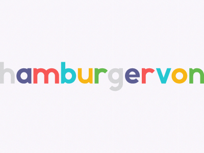
Beam Sans
Helvetic Brands®
Available for work
Follow
Following
Like
Get in touch
#F8F5FA
#27C8D1
#C1BBB3
#F75958
#5E5F94
#F7B515
#69B94F
#B9C96C
Download color palette
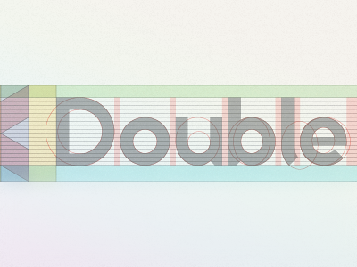
Expansion of the DoubleBeam identity.
Designed by the Helvetic Brands team.
Rebound of
Grid
By
Helvetic Brands®
custom
font
handmade
sans serif
typeface
typography
View all tags
Posted on Aug 3, 2012
2,597
11
65
4
View feedback
Helvetic Brands®
Outside the box design, Swiss style
Get in touch
More by Helvetic Brands®
View profile
Previous
Next
Loading…
Loading…
Loading…