Find designers
Designer search
Quickly find your next designer
Post a job
The #1 job board for design talent
Inspiration
Courses
UX Diploma
Learn UX design from scratch in 6 months
UI Certificate
12-week UI skill building for designers
Live interactive workshops
with design professionals
Jobs
Go Pro
Log in
Dribbble: the community for graphic design
Log in
Sign up
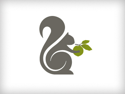
Squirrel Logo - Rebound
Jonathan Wood
Follow
Following
Like
#F9F9F9
#6A6760
#A09F9B
#C9D09A
#839318
#767D3B
Download color palette
Rebound of
Working Squirrel Logo #1
By
Jonathan Wood
animal
hospitality
squirrel
swirl
walnut
woodland
View all tags
Posted on Aug 2, 2012
2,298
2
23
6
View feedback
Jonathan Wood
More by Jonathan Wood
View profile
Previous
Next
Loading…