Yael, I like how you seek critiques, after all this is what dribble is all about right? I think "provisions" in this shot is a much nicer solution than using franchise as the font. This particular design meshes better than the last. Keep up the good work.
Hi @Andrew Merritt - thank you very much for the feedback. I also prefer this font. Seeking feedback is especially useful when you work in the more isolated freelance/small studio environment :)
11 Responses
Pro
Yael Miller
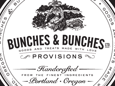
Here is a preview of the lid (black lid with white label printed 1-color black). This goes with the previous (face) labels.
10 months ago
Pro
Dan
Excellent type choice!
10 months ago
Pro
Kyle Anthony Miller
Looks really nice!
10 months ago
Pro
Yael Miller
Curious if you think I'd need to change the font on 'provisions' here to match the face label with the bolder font (see previous).
10 months ago
Pro
Michael Hester
perfect the way it is!
10 months ago
Loverly.
10 months ago
Pro
Yael Miller
@Michael Hester would you suggest any changes on the face labels? That was the bigger trouble :)
10 months ago
Pro
Caitlin McCormick
Did you do the illustration?
I love this!
9 months ago
nice!
9 months ago
Yael, I like how you seek critiques, after all this is what dribble is all about right? I think "provisions" in this shot is a much nicer solution than using franchise as the font. This particular design meshes better than the last. Keep up the good work.
9 months ago
Pro
Yael Miller
Hi @Andrew Merritt - thank you very much for the feedback. I also prefer this font. Seeking feedback is especially useful when you work in the more isolated freelance/small studio environment :)
@Caitlin McCormick - oh, no! That is the work of brilliant scratchboard artist, Roger Xavier. www.rogerxavier.com.
9 months ago