WeMeet - Logo Design Variations


Hello everyone!
So, as you know, I posted a version of the logo created for WeMeet. An application that helps some people find their half.
@Jord Riekwel has adviced me to make a change at the bottom of the logo. To make the ending of the stroke more sharply to make it consistent with the style of the overall shape. I want to thank him enormously for this advice!
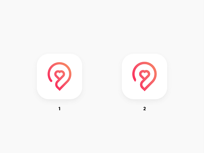
As you can see, here are two different versions and I want to know which one do you like more. First one or second.