@Nathan Powell you may be right..I think the alignment and sizing of the boxes is not quite right..
@Alexandre NaudThanks :D @Rafe Goldberg I agree, and thanks for the likes..well we may find that the simplicity will be back when everyone's had enough of the gloss..
8 Responses
Rebound to the amazing design by Daryl.
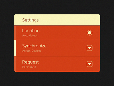
A Ui set of element may be coming up to follow some of the elements used in this such as the radio buttons etc.
10 months ago
Pro
Steffen Nørgaard Andersen
Love it! - great look and use of colors and padding
10 months ago
Pro
Nathan Powell
I love the red although I'd add more top padding to location
10 months ago
Pro
Alexandre Naud
Less is more !
10 months ago
Pro
Rafe Goldberg
The simple, almost un-styled buttons are great; antithetical to the pop and gloss of a world caught in the throws of Apple UI design dominance.
10 months ago
@Nathan Powell you may be right..I think the alignment and sizing of the boxes is not quite right..
@Alexandre Naud Thanks :D
@Rafe Goldberg I agree, and thanks for the likes..well we may find that the simplicity will be back when everyone's had enough of the gloss..
10 months ago
Pro
JARED KRAUSE
What typeface is this? Love the different shades on the left of the menu items.
10 months ago
@JARED KRAUSE Thanks for the like. The typeface is Maven Pro from LostType.
10 months ago