@Matt Zanchelli There's no reason to detail your icon, give it a little pattern or texture. It's so easy to go overboard though.
In some icons, it's completely okay to over detail. Games for instance demand it! But these kinds of utilities would be better off with simpler things, traditional gloss or not, stripes or not, just a gradient with a symbol would suffice.
Mostly, it comes down to taste. The Yelp icon doesn't suffer from having the stripes, and arguably doesn't gain much either. In this kind of job, you've got to do what you think is right, not just what the client might want.
I like these, but there's something off with the Starbucks one. I'm not sure why, but I'd never guess it was Starbucks by first glance and that's a bad sign.
The simplest thing you could do is use their shade of green they have in the logo. And use the same star they have (it kinda looks "fatter" - with shorter "arms", if you get my drift :D)...
@Kristy Marcinová I don't know how much you use the Starbucks app, but I use it nearly every day. They use a different green than the more emerald color for their logo. In addition, the use of the traditional five pointed star is heavily used in the app for rewards. You collect stars. It's how I remember that app. It made more sense to me to use a star than the logo or part of the logo.
Weird, this morning I had to buy a coffee at Starbucks and was looking for the app on my home screen (I didn't use Spotlight this time because I wanted to know where it was) and when I finally found it, I thought to myself how bad the icon was because it has a white background when it should be green like the Starbucks colour. Nice take on these brands, though I am not sure I entirely agree with a star icon for Starbucks, despite the name :)
While Louie's Chase and Yelp icons are right-on, I think the Starbucks icon would be impossible to recognize without the accompanying text - and while I know that stars are a central part of their perks program, the mermaid logo is far more recognizable.
So I took a quick stab at a similarly simple, but more recognizable, Starbucks icon. It's not perfect, but it's a start.
Completely agree. I already have two Ugly folders on my last home screen. Too bad, too, because a lot of these apps are useful. I just can't stand looking at them.
@Louie Mantia: To be honest, I didn't see the official app itself. You see, there isn't a special dedicated app for Starbucks here in Czech Republic.
Btw, you could still use a star for the app, I'm just saying you could use a less generic one, if you know what I mean.
I was just pointing out, even though I don't know what the app does, that it isn't really recognizable by itself.
Think of it this way - when I'd see it in a list of apps in the App Store, I guess I wouldn't download it since it doesn't look official to me, on first glance. Jason's rebound nailed it for my part at least.
@Kristy Marcinová I suppose this is the difference between browsing and searching in the App Store. I believe people looking for the Starbucks app will search "starbucks" and find it instantly.
Also, too many people specialize their icon for use in the App Store, and that's why so many of them are over-designed. They're made to "catch your eye" which is *not important* on your home screen. On your home screen its the most important to blend in.
Jason's is something I toyed with before I landed on this one, and while I think it's nice to have a cropped version of their logo, my assumption is they wouldn't ever meddle their logo, but they'd be more okay with using a *different*, but related symbol.
When Facebook updated their iOS app, they also renewed the app icon. Since those two apps sit next to each other on my homescreen I also wanted the other icons to be more flat. After all those years they got this “XP style”, which I really don’t like. Moreover Apple tweaked the glossy design to be more flat in iOS 6.
So I tried to make the Twitter icon flat and this is the result.
17 Responses
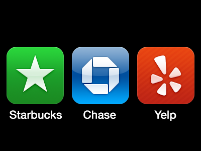
If you make your icon simpler, I will be more likely to put it on my home screen and not tucked away in a folder.
11 months ago
Agreed!
11 months ago
I agree with keeping it simple, so why the stripes?
11 months ago
@Matt Zanchelli There's no reason to detail your icon, give it a little pattern or texture. It's so easy to go overboard though.
In some icons, it's completely okay to over detail. Games for instance demand it! But these kinds of utilities would be better off with simpler things, traditional gloss or not, stripes or not, just a gradient with a symbol would suffice.
Mostly, it comes down to taste. The Yelp icon doesn't suffer from having the stripes, and arguably doesn't gain much either. In this kind of job, you've got to do what you think is right, not just what the client might want.
11 months ago
Totally agree with this, keep doing what you think is right.
11 months ago
I like these, but there's something off with the Starbucks one. I'm not sure why, but I'd never guess it was Starbucks by first glance and that's a bad sign.
The simplest thing you could do is use their shade of green they have in the logo. And use the same star they have (it kinda looks "fatter" - with shorter "arms", if you get my drift :D)...
But overall I love the simplicity!
11 months ago
@Kristy Marcinová I don't know how much you use the Starbucks app, but I use it nearly every day. They use a different green than the more emerald color for their logo. In addition, the use of the traditional five pointed star is heavily used in the app for rewards. You collect stars. It's how I remember that app. It made more sense to me to use a star than the logo or part of the logo.
11 months ago
Weird, this morning I had to buy a coffee at Starbucks and was looking for the app on my home screen (I didn't use Spotlight this time because I wanted to know where it was) and when I finally found it, I thought to myself how bad the icon was because it has a white background when it should be green like the Starbucks colour. Nice take on these brands, though I am not sure I entirely agree with a star icon for Starbucks, despite the name :)
11 months ago
I'm feeling this way more and more, especially with Utility apps..
11 months ago
Agree completely. There's some apps I use daily that I can't bear to have on my home screen because their icon is so horribly designed.
11 months ago
I totally agree to the keeping the icons simple!
It might be because we only have one Starbucks in Denmark but it really reminds me of Converse :)
Great work man!
11 months ago
Rebound
Starbucks icon
by Jason Stoff
While Louie's Chase and Yelp icons are right-on, I think the Starbucks icon would be impossible to recognize without the accompanying text - and while I know that stars are a central part of their perks program, the mermaid logo is far more recognizable.
So I took a quick stab at a similarly simple, but more recognizable, Starbucks icon. It's not perfect, but it's a start.
11 months ago
Completely agree. I already have two Ugly folders on my last home screen. Too bad, too, because a lot of these apps are useful. I just can't stand looking at them.
11 months ago
Made some exact versions of the Chase and Yelp icons a while back. I must be doing something right!
11 months ago
@Louie Mantia: To be honest, I didn't see the official app itself. You see, there isn't a special dedicated app for Starbucks here in Czech Republic.
Btw, you could still use a star for the app, I'm just saying you could use a less generic one, if you know what I mean.
I was just pointing out, even though I don't know what the app does, that it isn't really recognizable by itself.
Think of it this way - when I'd see it in a list of apps in the App Store, I guess I wouldn't download it since it doesn't look official to me, on first glance. Jason's rebound nailed it for my part at least.
11 months ago
@Kristy Marcinová I suppose this is the difference between browsing and searching in the App Store. I believe people looking for the Starbucks app will search "starbucks" and find it instantly.
Also, too many people specialize their icon for use in the App Store, and that's why so many of them are over-designed. They're made to "catch your eye" which is *not important* on your home screen. On your home screen its the most important to blend in.
Jason's is something I toyed with before I landed on this one, and while I think it's nice to have a cropped version of their logo, my assumption is they wouldn't ever meddle their logo, but they'd be more okay with using a *different*, but related symbol.
11 months ago
Rebound
Simplified Twitter iOS Icon
by Matthias Kampitsch
When Facebook updated their iOS app, they also renewed the app icon. Since those two apps sit next to each other on my homescreen I also wanted the other icons to be more flat. After all those years they got this “XP style”, which I really don’t like. Moreover Apple tweaked the glossy design to be more flat in iOS 6.
So I tried to make the Twitter icon flat and this is the result.
Would be nice to hear your opinion on this!
10 months ago