Find designers
Designer search
Quickly find your next designer
Post a job
The #1 job board for design talent
Inspiration
Courses
UX Diploma
Learn UX design from scratch in 6 months
UI Certificate
12-week UI skill building for designers
Live interactive workshops
with design professionals
Jobs
Go Pro
Log in
Dribbble: the community for graphic design
Log in
Sign up
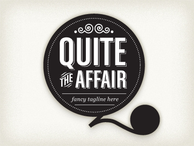
Quite the Affair - option 2
Kenny Barela
Follow
Following
Like
#F2F0EA
#232020
#CAC7BA
#9B9897
#5E5B5A
#413D3C
#C1BEB0
Download color palette
Requested brand attributes: classy, sophisticated, modern, stylish / hip
logo
View all tags
Posted on Oct 15, 2010
1,325
3
63
17
View feedback
Kenny Barela
More by Kenny Barela
View profile
Previous
Next
Loading…