Spottah Elements
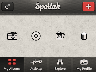

Ok that mysterious photo project I've been posting about is a redesign of a fantastic app called Spottah. Here are some of the elements, styles, and textures I'm using. Most were obtained here at Dribbble, including Jeff Broderick's Pattern, Alex's Texture, and Kenny Williams' Uicons.
I'm trying to figure out the accent color and would love some questions, or better yet, rebounds. As always, constructive criticism is greatly appreciated!


