Find designers
Designer search
Quickly find your next designer
Post a job
The #1 job board for design talent
Inspiration
Courses
UX Diploma
Learn UX design from scratch in 6 months
UI Certificate
12-week UI skill building for designers
Live interactive workshops
with design professionals
Jobs
Go Pro
Log in
Dribbble: the community for graphic design
Advance your career with a Professional Diploma in UX Design
Learn more
Log in
Sign up
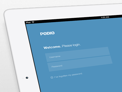
Podio iPad Login
Pete Lacey
for
Podio
Follow
Following
Like
#5092BD
#F1F1F2
#629DC4
#A1B3BF
#050506
#47555F
#3B85B5
#3D7498
Download color palette
Sweet 'n simple login screen for
Podio
iPad.
I shall never stop posting photos of iPads at angles.
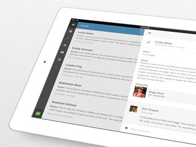
Rebound of
Podio for iPad
By
Pete Lacey
app
form
ipad
jaunty
login
podio
View all tags
Posted on Jul 27, 2012
25,073
95
351
19
View feedback
Podio
More by Podio
View profile
Previous
Next
Loading…