Icons-wip

12 Responses

  1. Pro Bruno Felicio Bruno Felicio

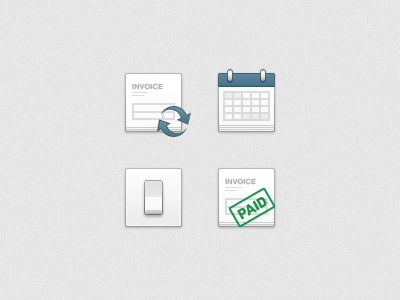
    Just some icons for an upcoming app restyling. What do you guys think?

    10 months ago

  2. Pro Ryno van Niekerk Ryno van Niekerk

    nice and clean

    likes

    10 months ago

  3. Pro Remko Dijksma Remko Dijksma

    I like :)

    likes

    10 months ago

  4. Pro Logan Johnson Logan Johnson

    Love 'em!

    likes

    10 months ago

  5. Pro Yummygum Yummygum

    Really nice. That's a lovely style you have. Not sure about the 'pressed' effect on the 'repeat' (or reoccurring?) arrows, since they don't overlay the icon entirely it looks like it goes through both the invoice papers and the background. Our two cents.

    likes

    10 months ago

  6. Pro Bruno Felicio Bruno Felicio

    @Yummygum You are right. The "sync" arrow should look more like if it was floating above the invoice icon. I'll change that. Thanks.

    likes

    10 months ago

  7. Pro Yummygum Yummygum

    Awesome, btw, just noticed the suggestion of a stack of invoices is enhanced by having the second invoice paper have a 2px margin and the bottom invoice paper a 1px margin. If you know what i mean. That's a great idea!

    likes

    10 months ago

  8. Pro Bruno Felicio Bruno Felicio

    @Yummygum Actually it has a 1px margin, it looks like 2px because the bottom "paper sheet" is slightly darker then the above one.

    10 months ago

  9. Pro Yummygum Yummygum

    @Bruno Felicio oh damn, that's even more clever :)

    likes

    10 months ago

  10. Pro Bruno Felicio Bruno Felicio

    @Yummygum ahah Thanks.

    10 months ago

  11. Pro Bert Devriese Bert Devriese

    Slick!

    likes

    10 months ago

  12. Pro Nathan Powell Nathan Powell

    man I really love your styling

    likes

    4 months ago

keyboard shortcuts: previous shot next shot L or F like