Paradise Falls | Spirit of Adventure

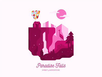
For this week's illustration, I decided to take it to the movie Up, into Paradise Falls.
.
I know that actual landscape wasn't actually like this, it was wider, more vast but I wanted to include some more detail and possibly show a different perspective, something lower to the ground.
.
One critic I have from this is the too much saturation. I'm still learning in terms of choosing color palette and composition. There's also not enough contrast between the fore ground and the cliff.
.
The balloons look slightly off, again, due to the color. Although, I like the composition of it, it was more challenging than I thought to draw up these mountains and surrounding landscape. Normally, with houses, you'd just draw a taller house next to it.
.
Any critics guys? Would love your feedback on this one. Definitely lots of room for improvement on this one.
.
Twitter: https://twitter.com/FarrelNobel


