Navigation Style Guide

Nav

1 Attachment

17 Responses

  1. 3magine 3magine

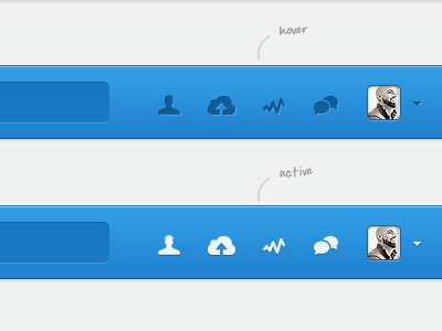
    Final navigation styleguide. Ugh, sorry @Bill S Kenney you're my favourite avatar ;)
    ------------------------------------------------------------------------------------
    Follow us on Twitter or show some love on Facebook

    11 months ago

  2. Nuruzzaman Sheikh Nuruzzaman Sheikh

    sleek!

    11 months ago

  3. Shaun Moynihan Shaun Moynihan

    Nice work man. I'd encourage you to modify the top of the 'Music' hover. It appears much blurrier than the 'People' hover.

    11 months ago

  4. 3magine 3magine

    @Shaun Moynihan That's what I get for working with multiple icon sets and resizing in photoshop :(

    11 months ago

  5. Mike Busby Mike Busby

    Love the colors.

    11 months ago

  6. Misha Nesoleniy Misha Nesoleniy

    nice concept!

    11 months ago

  7. Remko Dijksma Remko Dijksma

    I think @Shaun Moynihan means the tooltips in the hover state :)

    Also I think the search form could use a little more depth, nice work :)

    11 months ago

  8. Julia Khusainova Julia Khusainova

    @3magine really like the crispness of your work.

    And agree with what @Shaun said.

    11 months ago

  9. Guillaume Gaubert Guillaume Gaubert

    If you wanted to design like a "pressed" state for the active state, I'd recommend you to set the dark drop shadow of your icons to -90°. I'd set the dark inner shadow of the search field not only to the top. Maybe a subtle inner shadow would look great?
    The color of the bar is maybe too blue.

    11 months ago

  10. 3magine 3magine

    @Remko Dijksma got ya. It's due to a lide shadow on the tooltip, that is also used sitewide over light backgrounds where it looks good. May have to use a dark tooltip over a darker background, or drop the shadows.

    @Guillaume Gaubert I prefer the inner shadow at -120 or -135. The search field does have an inner shadow once again at 120. And you can never be too blue my friend ;)

    11 months ago

  11. Remko Dijksma Remko Dijksma

    @3magine or you make the stroke on that gray tooltip darker ;) so the white inner shadow standsout more:)

    11 months ago

  12. 3magine 3magine

    @Remko Dijksma I could, but it would be too dark over a light background, and I want to keep all styles consistent.

    likes

    11 months ago

  13. Fred Yates Fred Yates

    what hand written font is that?! i need it

    11 months ago

  14. 3magine 3magine

    @Fred Yates It is Ardleys Hand.

    likes

    11 months ago

  15. Enzo Li Volti Enzo Li Volti

    I do not like tooltips in music and people, I would try a different solution.. but it is a nice work!

    11 months ago

  16. krishnachaitanya krishnachaitanya

    like it! :)

    11 months ago

  17. imshahid imshahid

    dont they look similer to dribbble icons

    10 months ago

keyboard shortcuts: previous shot next shot L or F like