Remove Photo

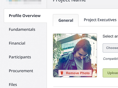

Here is a part of profile editing screen. As you see there are lots of vertical, horizontal tabs with lots of forms in them... I also attached bigger view.
Comments are much appreciated, Thanks!
tweet tweet
Here is a part of profile editing screen. As you see there are lots of vertical, horizontal tabs with lots of forms in them... I also attached bigger view.
Comments are much appreciated, Thanks!
tweet tweet


