2 Lonely Cacti

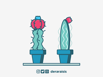
This illustration started its journey as a cheerful one. Two minimal cacti sitting together: that was my sketch on a small notepad. What could go wrong with a simple drawing like that?
After I vectorized the cacti sketch, the next step was choosing a color palette. So, I decided to use “cayenne” as part of the palette. Then came green for the bodies of cacti. But at some point, while I was experimenting with colors at Adobe Color, I decided to turn the greens to a more blueish tone. That was the move changed the destiny of this illustration.
Using blueish tones turned illustration’s atmosphere to a more depressed one and made two cheerful cacti look lonely somehow. This is where the absurd name of the illustration comes and this is the power of color usage.
You may download the wallpaper version of this illustration at Susam Creative's blog. Here is the link.


