@Matt: You have to purchase the Web Pro version at FontFont, then there's an option to automatically add it to your kit. In other words, it's not (unfortunately) a free font in the Typekit library.
Love it! The new lightened color palette and the smart new branding are looking sharp. Also, +100 for a Gridulator shout out! (Though about that last nameā¦)
Lovely! I like this palette a lot. And that hover is genius.
But.. I miss the old simplebits logo to be honest. I always loved that it hinted at pixels and code without smacking you over the head with it. I saw the new logo and it's still really nice but feels less descriptive to me of what you do somehow.
I haven't gotten around to checking out the new typekit fontfont stuff, good to know! I guess the only way to find out what all the web fonts are is to search their products for the word web?
45 Responses (page 1 of 2)
Pro
Dan Cederholm
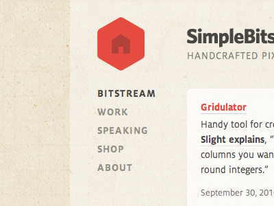
Tweaking the typography, and I think I've settled on FF Milo via Typekit for the main font.
over 2 years ago
Great choice on the color palette. :D
over 2 years ago
Pro
Dan Cederholm
Thanks, Addison. Going back to basics :)
over 2 years ago
Pro
Trent Walton
upgrade! Very nice.
over 2 years ago
Pro
Brian White
love the milo..
over 2 years ago
So you've decided to go for the rebranding? I remember you saying you were just playing around and then started to get interesting! :-)
over 2 years ago
Pro
Jory Raphael
Very nice. Will there be different icons in the new logo for each page? Or is the home icon the hover state, with the "SB" as the static?
over 2 years ago
Pro
Dan Cederholm
@Philip: Likely :) Might take a while though.
@Jory: Yep, this is just the logo's hover state.
over 2 years ago
Pro
Jory Raphael
@Dan: Doh, just looked at the actual title of the shot. Kinda self-explanatory :)
over 2 years ago
Yummy logo.
over 2 years ago
Pro
Oscar Barber
Like it! ;) Nice "home" logo!
over 2 years ago
FF Milo via Typekit? Where exactly - may I ask?
over 2 years ago
Pro
Dan Cederholm
@Matt: You have to purchase the Web Pro version at FontFont, then there's an option to automatically add it to your kit. In other words, it's not (unfortunately) a free font in the Typekit library.
over 2 years ago
@Dan: Blimey! Only updated to the Portfolio plan a few days ago and now look what you've gone and done ;)
over 2 years ago
Not sure if I'm late to the game, but really digging (dibbbing?) the new cube house!
over 2 years ago
Pro
David Sleight
Love it! The new lightened color palette and the smart new branding are looking sharp. Also, +100 for a Gridulator shout out! (Though about that last nameā¦)
over 2 years ago
I think this is screaming for a textureless/plain background
over 2 years ago
Pro
Jackson Latka
Looks great. I've always liked the flip-up corner hover state that you currently use, but this is a nice progression.
over 2 years ago
Pro
Morgan Allan Knutson
That looks like my PPF logo rollover :)
over 2 years ago
Pro
Dan Cederholm
@David: Gah! Apologies.
over 2 years ago
Pro
Michael Spitz
Digging that color a lot!
over 2 years ago
Pro
David Sleight
@Dan: Seriously no worries at all, sir! Honored by the link. Hope it's proving useful!
over 2 years ago
Pro
David Myers
Love it - Well done!
over 2 years ago
Lovely! I like this palette a lot. And that hover is genius.
But.. I miss the old simplebits logo to be honest. I always loved that it hinted at pixels and code without smacking you over the head with it. I saw the new logo and it's still really nice but feels less descriptive to me of what you do somehow.
I haven't gotten around to checking out the new typekit fontfont stuff, good to know! I guess the only way to find out what all the web fonts are is to search their products for the word web?
over 2 years ago
Pro
Darren Geraghty
This is great, love the palette.
over 2 years ago