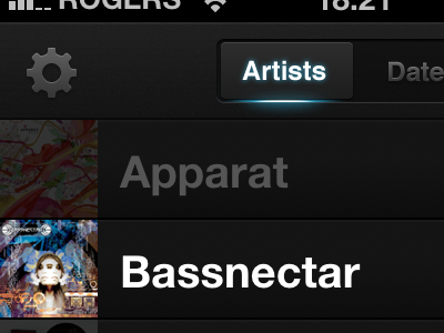
Following lead of @samvermette around segmented control design. I like the idea of showing this as a switch instead of the "depressed-is-active" metaphor that's default for segmented control on iOS although I'm still not happy with how fuzzy mine looks on the edges.
Tip for anyone creating the images to customize iOS controller with appearance protocol: the middle segments all need to be the same size otherwise you get a weird gap.
Nice point of view.. For the first impression i thought that the pressed button was active, but if you are planned the interaction such as a swipe choose, it will work.
Great details.
2 Responses
Following lead of @samvermette around segmented control design. I like the idea of showing this as a switch instead of the "depressed-is-active" metaphor that's default for segmented control on iOS although I'm still not happy with how fuzzy mine looks on the edges.
Tip for anyone creating the images to customize iOS controller with appearance protocol: the middle segments all need to be the same size otherwise you get a weird gap.
10 months ago
Pro
Daniel Mack
Nice point of view.. For the first impression i thought that the pressed button was active, but if you are planned the interaction such as a swipe choose, it will work.
Great details.
9 months ago