Infographic

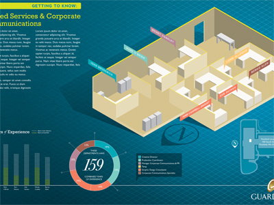
A shot of an infographic I have been working on for a client. Aimed at showcasing years of experience and total combined years of experience of the employees within that department.
(secret fact: the idea for the isometric graphic of the cubicles/desks came about after seeing the isometric guide lines that Kyle Jones had in one of his shots.)


