The white stroke before the blue/grey outer glow is putting me off a bit and I think the top of the blue gradient is a little too dark though. Maybe reduce the size of the white gap a little?
This has a nice widget-y feel to it, really like the active state. Might want to reconsider the user-silhouettes icon. Their heads are a little big, or at least too circular imo.
19 Responses
Pro
James ✌
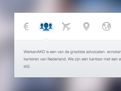
This is something fun that i'm working on for a client...
10 months ago
Pro
Dominik Schmidt ⚛
those icons are great!
10 months ago
Pro
Daryl Ginn
Very sleek. I'd prefer it if the icons were flat colours, rather than gradients, though.
Also, you should probably change 'cvbvcbcvbvcbcvbcvb.png', you may be giving away too much about the project. ;)
10 months ago
Pro
Elliot Jackson
Nice!
The white stroke before the blue/grey outer glow is putting me off a bit and I think the top of the blue gradient is a little too dark though. Maybe reduce the size of the white gap a little?
Edit: I agree with @Alexandre Naud about the euro icon.
10 months ago
Pro
Daniel Post
@Daryl Ginn The text gives away much more than that.
10 months ago
Pro
Alexandre Naud
The last icon is just awesome. Great work as usual, but not sure about the euro icon.
10 months ago
very good!
10 months ago
Pro
Maxime De Greve ✈
Aaaah come one James, all this Dutch in your shots, time to have our conversations in Dutch from now on!
10 months ago
Pro
Robert van Klinken
Goed bezig James! Als je op bezoek komt drinken we een biertje.
10 months ago
Pro
Thom
Ja, volgens mij spreekt James prima Nederlands... :P
10 months ago
Pro
James ✌
@Robert van Klinken, @Thom — Have no idea what you guys just said, but cool! haha
10 months ago
I agree with @Elliot about the gap.
It's beautiful though!
10 months ago
Pro
Bobby Giangeruso
ja, svols dkijs lkjwwis wih!
10 months ago
Pro
James ✌
@Robert van Klinken Ja, laten we een biertje als ik ooit naar Nederland!
10 months ago
Pro
Bobby Giangeruso
Lol, I'm from New Jersey. I was just cleaning my keyboard. But nice work!
10 months ago
Pro
Yummygum
This has a nice widget-y feel to it, really like the active state. Might want to reconsider the user-silhouettes icon. Their heads are a little big, or at least too circular imo.
10 months ago
Pro
Hugo Loning
Come to our little country and we'll throw you a party! ; ) Oh and nice shot!
10 months ago
Nice icons great work :)
10 months ago
Pro
Mario Bieh
Good looking wizard.
10 months ago