Find designers
Designer search
Quickly find your next designer
Post a job
The #1 job board for design talent
Inspiration
Courses
UX Diploma
Learn UX design from scratch in 6 months
UI Certificate
12-week UI skill building for designers
Live interactive workshops
with design professionals
Jobs
Go Pro
Log in
Dribbble: the community for graphic design
Log in
Sign up
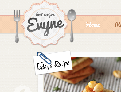
Nom Nom Nom
Iris Atalay
Available for work
Follow
Following
Like
Get in touch
#F2F0EC
#F6D4B4
#A19F9B
#604C40
#BA9761
#925835
#416996
#DAB3A3
Download color palette
attach
clip
cute
fork
recipe
ribbon
spoon
texture
web design
View all tags
Posted on Jul 16, 2012
5,112
3
64
10
View feedback
Iris Atalay
Get in touch
More by Iris Atalay
View profile
Previous
Next
Loading…
Loading…
Loading…