Find designers
Designer search
Quickly find your next designer
Post a job
The #1 job board for design talent
Inspiration
Courses
UX Diploma
Learn UX design from scratch in 6 months
UI Certificate
12-week UI skill building for designers
Live interactive workshops
with design professionals
Jobs
Go Pro
Log in
Dribbble: the community for graphic design
Log in
Sign up
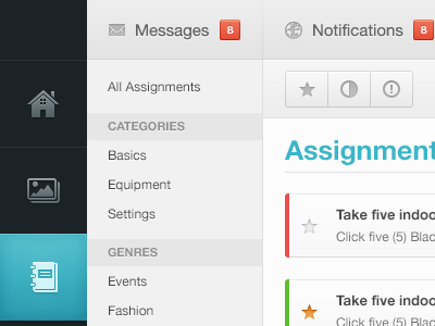
Assignments
Haziq Mir
Available for work
Follow
Following
Like
Get in touch
#F0F1F1
#1C2326
#4AB6C6
#B6D5D9
#A3A4A4
#5D6162
#CB6D47
Download color palette
assignments
buttons
form
glyphs
light
list
menu
navigation
sidebar
star
toolbar
ui
ux
View all tags
Posted on Jul 15, 2012
108,316
320
1,142
34
View feedback
Haziq Mir
/hɑːzik/ Here's some of my older work.
Get in touch
More by Haziq Mir
View profile
Previous
Next
Loading…
Loading…
Loading…