W + H + House Monogram

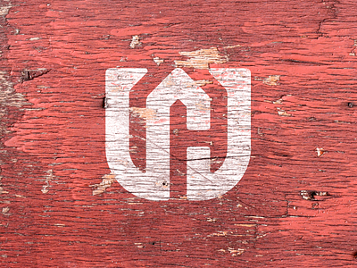

Logo icon I've been working up for a renovation and custom carpentry company in the middle of a complete rebrand.
My approach started off only trying to incorporate the W, and then the H if possible. While doing so most of my ideas were unfortunately already conceptualized by other designers/companies (Shout out to @Steve Raboin, @MarkFly, and @Salih Küçükağa for laying down some other killer WH pieces I stumbled across in my research).
After discovering this, I went back to the drawing board… literally, and tried incorporating a minimal house shape into the monogram to help set this company apart. While doing so I discovered a completely unused concept where I was able to create a “W” as well as a “H” in the negative space with a minimal house shape(or peak) in the middle of the W.
What are your thoughts on the concept?
More to be published soon.


