Ampersand Love

A_a

10 Responses

  1. Erica Birkman Erica Birkman

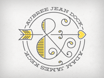
    The beginnings of wedding invitations for two lovely friends of mine. Any and all feedback is much appreciated!

    10 months ago

  2. Brandon Davis Ward Brandon Davis Ward

    Great balance and tasteful use of color. You may want to try flipping "Adam James Keck" so that it's right side up and slightly more legible. Just a thought. Looks great @Erica Birkman !

    likes

    10 months ago

  3. Pro Ryan Lee Ryan Lee

    Nice Erica!

    10 months ago

  4. 10 months ago

  5. Faheema Patel Faheema Patel

    Lovely monogram! I also agree with @Brandon about rotating the name so it's more legible

    10 months ago

  6. Erica Birkman Erica Birkman

    @Brandon & @Faheema I flipped the lower name around in the final and it looks much better! Thanks for the feedback.

    likes

    10 months ago

  7. Pro Bill S Kenney Bill S Kenney

    well played.

    7 months ago

  8. Pro Pete Lada Pete Lada

    Love it. What font is that?

    4 months ago

  9. Erica Birkman Erica Birkman

    @Pete Lada it's Deming from Lost Type Co. http://www.losttype.com/font/?name=deming

    4 months ago

  10. Pro Pete Lada Pete Lada

    Thanks!

    4 months ago

keyboard shortcuts: previous shot next shot L or F like