Find designers
Designer search
Quickly find your next designer
Post a job
The #1 job board for design talent
Inspiration
Courses
UX Diploma
Learn UX design from scratch in 6 months
UI Certificate
12-week UI skill building for designers
Live interactive workshops
with design professionals
Jobs
Go Pro
Log in
Dribbble: the community for graphic design
Log in
Sign up
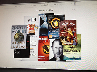
goodreads redesign
Matthew Sanders
Follow
Following
Like
#DFDCD7
#C3BCB3
#1E1A19
#5A4643
#A84933
#9D9771
#CEC9B7
Download color palette
Design exercise for "currently reading".
bauhaus
black
books
clean
goodreads
navigation
read
simple
ui
white
View all tags
Posted on Jul 13, 2012
3,619
3
48
8
View feedback
Matthew Sanders
More by Matthew Sanders
View profile
Previous
Next
Loading…