Looka - Symbol Construction

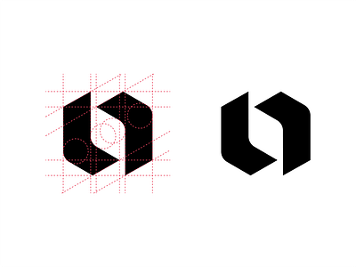


This is the grid that I used to create the Looka symbol. A grid was used to ensure balance and symmetry. The Looka symbol forms the most significant feature of the Looka product and brand identity. It is simple in shape and form but unique enough to stand out and be identified as Looka.
To see the whole project click the link below:
https://kaejon.com/looka
Read the full case study here.
https://kaejon.com/case-studies/looka


