Find designers
Designer search
Quickly find your next designer
Post a job
The #1 job board for design talent
Inspiration
Courses
UX Diploma
Learn UX design from scratch in 6 months
UI Certificate
12-week UI skill building for designers
Live interactive workshops
with design professionals
Jobs
Go Pro
Log in
Dribbble: the community for graphic design
Log in
Sign up
Alternate Style Experiment
Matthew Daniels
Available for work
Follow
Following
Like
Get in touch
#F8F8F8
#090809
#6FBD97
#71817D
#B0EACF
#3C4B49
Download color palette
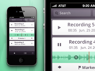
Experimenting with a more flat, minimal style for the app I'm currently working on.
audio
button
interface
list
list view
pause
playback
ui
wave form
View all tags
Posted on Jul 12, 2012
9,116
13
98
8
View feedback
Matthew Daniels
Get in touch
More by Matthew Daniels
View profile
Previous
Next
Loading…
Loading…
Loading…