The "i" is a little hard to see, it makes the word as a whole not as clear. But I really like the general shapes of the L, f, e. And I like the varying levels of gray within the letters as well, it'd be neat to keep some of that in the final, kind of like a watercolor stroke where the edges are darker than the center.
The "i" seems just a tad cramped. The space between the "e" and the "l" is just slightly more. Looking good though! Are you going to hand letter the "return to" or use a typeface?
@Chris Biron thank you man, I might have to lose few of them now that I look at it might be too much.
@Ian Dale thank you so much mate, It's definitely work in progress and very nice to hear some feedback, "i" does need more work and I'll make sure it becomes more readable. As far as watercolor with dark stroke feel goes that's an interesting idea, it was going to be just solid vector but I might play around with that idea. Thanks again!
@Herson Rodriguez wow, I didn't even realize that but yes, That could be another meaning, return to life - no going back! ;)
@Steven Hasegawa yeah I'll definitely play with spacing once it gets traced in illustrator. Not sure yet what the plan is with "return to". Thank you for the feedback!
33 Responses (page 1 of 2)
Pro
Eddie Lobanovskiy
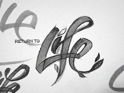
Rough logo sketch, let me know what you guys think.
"Return to Life" is a local Christian Drug Rehabilitation Center.
10 months ago
Really nice! Love the leaves included, especially on the 'i'
10 months ago
Pro
Ian Dale
The "i" is a little hard to see, it makes the word as a whole not as clear. But I really like the general shapes of the L, f, e. And I like the varying levels of gray within the letters as well, it'd be neat to keep some of that in the final, kind of like a watercolor stroke where the edges are darker than the center.
10 months ago
Pro
Herson Rodriguez
I swear thats suposed to say 4 Life right? Its right there!!!
Looks sweet
10 months ago
Pro
Andrea Cau
Really cool Eddy. As always ;)
10 months ago
The "i" seems just a tad cramped. The space between the "e" and the "l" is just slightly more. Looking good though! Are you going to hand letter the "return to" or use a typeface?
10 months ago
Pro
Eddie Lobanovskiy
@Chris Biron thank you man, I might have to lose few of them now that I look at it might be too much.
@Ian Dale thank you so much mate, It's definitely work in progress and very nice to hear some feedback, "i" does need more work and I'll make sure it becomes more readable. As far as watercolor with dark stroke feel goes that's an interesting idea, it was going to be just solid vector but I might play around with that idea. Thanks again!
@Herson Rodriguez wow, I didn't even realize that but yes, That could be another meaning, return to life - no going back! ;)
10 months ago
Pro
Eddie Lobanovskiy
Thanks @AndyTheJoker ! :)
@Steven Hasegawa yeah I'll definitely play with spacing once it gets traced in illustrator. Not sure yet what the plan is with "return to". Thank you for the feedback!
10 months ago
Pro
Herson Rodriguez
Very cool! :)
10 months ago
Pro
Udhaya (via Bas Studio)
awesome :)
10 months ago
I think all the T's should be jesus crosses.
10 months ago
Pro
krishnachaitanya
really awesome! great work mate! :)
10 months ago
That's pretty cool!
10 months ago
Pro
Jonathan Russo
Nice work
10 months ago
Pro
Jackson Stephens
You just need to slow down there, mister. Let the rest of us catch up.
10 months ago
Pro
Jonathan Howell
I love this, it should be 4Life though ;)
10 months ago
Pro
Matt Lange
I would get this as a tattoo in a heartbeat.
10 months ago
Pro
Tanveer Junayed
Really like the concept on "i" & "e". Go with it bro!
But I think it's little too leaves tho. May be kill some of em.
10 months ago
Pro
Ivan Arango
where i can get those sharpies!? Nice work!
10 months ago
Pro
Eddie Lobanovskiy
@Herson Rodriguez @bas @krishnachaitanya @Hian Battiston @Jonathan Russo @Matt Lange thanks fellas!
@Steven Schroeder originally they wanted that, but I thought it might be too much, thank you tho! :)
@Jackson Stephens hahaha, neva! ;P
@Jonathan Howell hehe well now i am thinking it could be a second meaning as @Herson Rodriguez pointed out.
@Ivan Arango http://www.jetpens.com/ :)
@Tanveer Junayed yeah definitely should go easier on leafs and appreciate your feedback bro! :)
10 months ago
....I was just messing with ya. Didn't think you'd take me seriously :p
10 months ago
Pro
David Kovalev
very cool bratha, i'd maybe give the letters "L-i-f" a bit more room to breath (kerning wise)... other than that put a stamp on it and send er' out :)
10 months ago
Pro
Florin Capota
off to a great start!
10 months ago
Pro
Mani
looks great @Eddie Lobanovskiy
Edit: it is great :)
10 months ago
Pro
Enzo Li Volti
i definitely love this!
10 months ago