


Support App

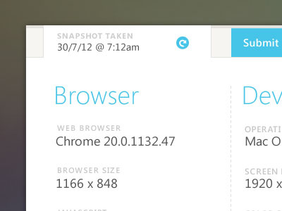

We're building a tool not unlike this one. We'd send this to any customer having technical issues. The app would automatically grab the details of their computer environment and return it to us with one click. Easy parcheesi.
The background was adapted from this shot by @Florin Gorgan


